| Dashboard | March 2024 | Kietzee | together with David Can Umar |
Intro
Kietzee is the online service of the energetic American-German couple Jeff and Lisa, parents of two living in Berlin. The project was born out of pure neccessity – they needed to navigate through the meanders of the local legal, social and healthcare systems. Most of the information available in the infosphere was only in German language, so the couple decided to create a platform for parents with an extra focus on expats and non-locals. Moreover, most competitors’ products are aimed at mothers or are dedicated to observing the development of the fetus or child, rather than providing practical information about life around the pregnancy.
Kietzee is meant to be practical, parent-centered, father-inclusive and foreigners-friendly.

About the project
The scope of this two-week sprint was the creation of a Dashboard feature to the extisting and functioning website. The users should be shown their personalized journey’s timeline:
– adjusted to the stage of their pregnancy based on the expected delivery date or
– adjusted to the age of the infant based on the factual delivery date.
Pre-evalution & scope concretization
Although this wasn’t directly our task, we evaluated various information and data obtained from the Client prior to creating Dashboard. We checked, among other things, whether the Kietzee’s User Persona was consistent with real data (Google Analytics) and potential users’ profile, we performed Heuristic Evaluation and checked the Information Architecture stucture. Our findings were delivered to Clients, containing a detailed description of assessed problem areas, proposed solutions and proposals which activities we can incorporate into our scope.
Ultimately, we agreed that we would create a responsive Dashboard and also propose a new color palette and icons for the portal. We chose a mobile phone as the dominant platform and that is where the flow is presented.
Color palette and icons style
Kietzee’s main color was Teal and we haven’t changed it to keep the brand identity intact. Unfortunately, full previous color pallete did not always meet accessibility standards and sometimes conveyed ambivalent signals (clay red as a call to action, for example). So we created a new palette around the main Teal color.

It was really a challenge, because such a delicate topic evokes many emotional responses and it’s difficult to find a compromise. We were committed, however, to avoid too mommy vibe, as well as colors traditionally associated with the child’s gender – pure pink and blue. We proposed 4 color palettes and evaluated them in a Google Form. The palette presented below was the unrivaled winner (52% of votes).

The next step was to create icons for the website. While rounded shapes evoke warmer emotions and are associated more with care, they can sometimes evoke a sense of lack of professionalism. And no one wants a pregnancy help service to be frivolous! On the other hand, symbols that were too sharp seemed unfriendly to parenting.
After a series of tests, we found a solution in simple geometric shapes, but with rounded corners.
Dashboard

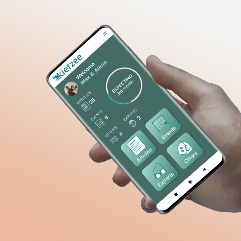
Our goal was not only to present the most important content for the user, but also to engage them in using the service without receiving constant notifications and emails. We tried the soft Gamification – presenting a status that creates a sense of achieving a goal and motivates to do more, but without setting specific goals to achieve, which may be potentially stressful during pregnancy. Parents’ peace of mind is a priority! It’s making parenthood easier.
The User sees the number of articles read, events attended, offers redeemed, as well as professionals whom they consider important in their journey. Additionally, they immediately see the pregnancy status or age of the child – a journey’s indicator.
At the bottom of the screen there are tiles with give only information adapted to the user’s moment in their journey.
Information Architecture

The main need of the Dashboard was to sort the information in such a way that it was available clearly and not overwhelmingly. To achieve this effect we used card sorting and testing, testing and once more testing.
After clicking on a tile, the roll of a given section expands.
In the case of articles, the content is additionally divided into Beaurocracy – articles about the intricacies of the German socio-legal sphere, Health – about the physical health of the child and parents, and Self Care – a section for parents about taking care of their soul and balance.


The Event section expands into a calendar that shows the user his month. The Toggle allows them to turn off the types of events that they are not interested in. A bisque colored circle denotes events for Expecting parents, teal one – for Parenting, a half-half bisque and teal circle for both categories, and a bisque circle superimposed on teal suggests that there are events from more than one category that day. The arrows allow to navigate forward or backward to show events from other months.
When the user clicks on a day, a list of events for that day unfolds. The name of the event, its date and time, category and place are presented. After clicking on the selected event, a full description appears.
Offers expand to Header height. Here, too, only the most important information is shown, and the user can see more by clicking on a specific product. The situation is similar in Experts section. The user sees experts’ profile picture, their name, roles, and the options of meeting the clients. Both screens can be scrolled.
Integrating existing features with the new Dashboard
David Can and I did not design the content view – i.e. individual articles, events, etc. However, these features had to be integrated with a new way of displaying content – our dashboard. We decided to create simple buttons that can be easily added to templates. We used colors from the new palette – system status pending and system status success.


Key Learnings and Prototype Recording
Parenthood, due to the biological process of pregnancy, is, of course, most strongly associated with women. Designing a solution for parents by two men may encounter difficulties related to some kind of prejudice or sense of inadequacy. Empathy, sensitivity in presenting content and awareness of the discrimination that women face every day is the only way to complete the creative process. On the other hand, working on such a project gives insight into information that – for reasons that are completely incomprehensible to us – are neither discussed in schools nor discussed much in society. This project was therefore also a very strong lesson about pregnancy and motherhood for us – potential fathers. And a reminder to stay humble.
In my personal opinion, the biggest challenge in this project was not the choice and display of information – our original scope – but finding the right color palette. Colors related to parenthood are very deeply rooted in culture – and because the product pays special attention to expats, cultural sensitivity was a must. What one respondent considered to be ideal colors, other – for cultural reasons – could consider as completely unacceptable.

We also made versions for a computer screen. The difference from the mobile version is only that the tiles do not expand after clicking the icons, and the content is already visible earlier. To enlarge a given window, one needs to click the “Expand” icon.
To give our client more time and opportunity to implement the project in steps, we also created a prototype in the existing Kietzee’s colors. Rome wasn’t built in a day!
I hope you enjoyed this project and that it really makes parenthood easier!
| ROLES | DELIVERABLES | DURATION AND TOOLS |
|---|---|---|
| User Research User Experience Design Interface Design Visual Identity Information Architecture |
Dashboard Style tile Customed icons Responsive hi-fi prototype Hand off to devs |
2-week sprint Figma & Illustrator User Interviews User testing & card sorting User Flow Google Analytics Gamification |
Credits
- screenshots of Kietzee’s website from March 2024,
- AI Mockup for Figma desgin,
- iMockup for Figma design,
- Unsplash for Figma design:
- Portrait of a black man architect at a building site looking at camera (…)
- Portrat einer nicht binaren (…)
- A few icons from Phosphor Icons for Figma design [CC-BY 4.0]